Smooth Trendline with Pandas DateTime Axis Using Matplotlib
an implementation for creating a smooth line over a datetime dataset with pandas and matplotlib.
TLDR
This post shows an implementation for creating a smooth line over a datetime dataset with pandas and matplotlib.
Introduction
I recently ran into an issue where I wanted to make a smooth line over a 2 dimensional dataset. I'd been messing around with R and thought the geom_smooth looked quite nice - so I sought to essentialy mimic that functionality.
I'm not an expert on the different methods to make a smooth line. Some googling will show you that there are many, and I'm sure there are reasons to use one or the other.
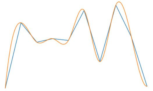
In my search I ended up at this post which shows an implementation of make_interp_spline from the Scipy library. Basically, this interpolates a smooth line that goes through each point in the dataset.
Their implementation wasn't too difficult to code, but when I went to apply it to my data and realized I had an issue. I was using a datetime for the X axis.
After some robust googling I figured out how to adapt this implementation. There wasn't much on StackOverflow or even google for that matter, so I figured I'd make this simple blog post outlining my solution.
Briefly, the solution uses matplotlib.dates.date2num and matplotlib.dates.num2date to make the conversions all work nicely together.
Imports
import pandas as pd
import numpy as np
import matplotlib as mpl
import matplotlib.pyplot as plt
from scipy.interpolate import make_interp_spline
make a sample dataset
data = pd.DataFrame({
'time' : pd.date_range(start='1/1/2019', periods=10, freq='Q'),
'values' : np.random.randint(low=50, high=100, size=10)
}).set_index('time')
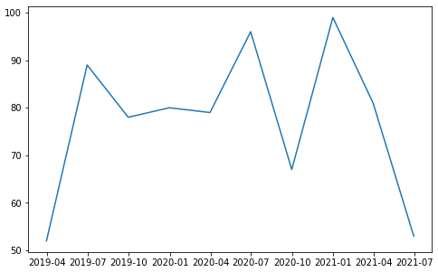
data
| time | values |
|---|---|
| 2019-03-31 | 52 |
| 2019-06-30 | 89 |
| 2019-09-30 | 78 |
| 2019-12-31 | 80 |
| 2020-03-31 | 79 |
| 2020-06-30 | 96 |
| 2020-09-30 | 67 |
| 2020-12-31 | 99 |
| 2021-03-31 | 81 |
| 2021-06-30 | 53 |
Baseline figure
fig,ax = plt.subplots(figsize=(8,5))
ax.plot(data.index, data.values)
Use date2num to convert the min/max dates to numeric concordant with how matplotlib does for it's plots.
min_date = mpl.dates.date2num(data.index.min())
max_date = mpl.dates.date2num(data.index.max())
x_new = np.linspace(min_date, max_date, 1000)
print(f'min_date: {data.index.min()} -> {min_date}')
print(f'max_date: {data.index.max()} -> {max_date}')
min_date: 2019-03-31 00:00:00 -> 17986.0
max_date: 2021-06-30 00:00:00 -> 18808.0
x_new[:10]
array([17986.        , 17986.82282282, 17987.64564565, 17988.46846847,
       17989.29129129, 17990.11411411, 17990.93693694, 17991.75975976,
       17992.58258258, 17993.40540541])
Convert the index dates to numeric and use that to fit the Spline
a_BSpline = make_interp_spline(data.index.map(mpl.dates.date2num), data.values)
y_new = a_BSpline(x_new)
y_new[:10]
array([[52.        ],
       [52.80388298],
       [53.59690985],
       [54.37914392],
       [55.15064847],
       [55.91148681],
       [56.66172224],
       [57.40141806],
       [58.13063756],
       [58.84944405]])
Final result
fig,ax = plt.subplots(figsize=(8,5))
ax.plot(data.index, data.values)
ax.plot(x_new, y_new)
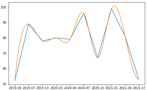
Conclusion
In conclusion, use matplotlib.dates.date2num and num2date in order to generate the necessary conversions to allow the use of the scipy methods.